A Website Designing Company helps you register your presence on the Internet. It acts as your online identity and introduces your business to people.
It is important to own a website and most businesses have their websites on the Internet, but it isn’t enough if it doesn’t reach out to your audience at the right time.
As technology is evolving each day and becoming more accessible people are switching to different devices to access the Internet, ranging from small-screen mobile phones to huge screen televisions. Mobiles, tablets and smartwatches are gaining popularity as people can access the Internet over them, even while on the go. To ensure your customers can access your website 24/7 through any of these devices, you need to optimize it. This makes understanding modern web technologies essential.
The websites built for desktops if used on mobile phones, face issues like: tiny fonts which cannot be read easily, panning and zooming is required to view sections clearly, slow speed due to high loading time, difficulty in accessing links or tabs. These issues may lead to an unpleasant user experience, resulting in increased bounce-back rates.
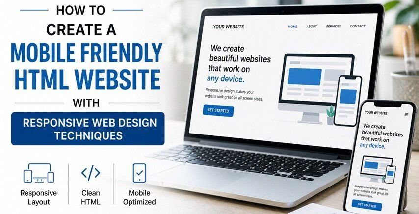
Even mobile phones from different brands come in different sizes, configurations and resolutions, so there’s isn’t a format that can be used perfectly on every device.The solution is to create a responsive website, which is mobile-friendly and all content on it is appropriately sized. A responsive website is one in which all your web page content, including text, images, multimedia and videos, adjusts itself to optimally fit the screen of any device. It ensures an optimum viewing experience for viewers regardless of the device they are using.
Building websites for multiple devices with varied capabilities, screen sizes and interaction modes needs basic knowledge of HTML/CSS and analytics of user behavior to create a mobile-friendly HTML website. It also supports developing practical skills in web development. A responsive web design adapts your website layout to your user’s viewing environment by using fluid, proportion-based grids, flexible images and media queries.
Listed below are the steps to create a mobile-friendly HTML website:

Use HTML:
Flash is an obsolete technology as it’s not good for SEO and mobile devices do not support it. It slows down the loading speed of your webpages, so using HTML is a more compatible option.
Incorporate the fluid grid concept:
Switch to fluid grid layout to size page elements in relative units like percentages, instead of adaptive grids that use absolute units like pixels or points. The adaptive grids require manual adjustment of widths and heights in different viewports. Using a fluid grid in its place is beneficial as they flow naturally within the dimensions of the parent container and require less adjustments for different devices.
Set the viewport meta tag:
Browsers in smartphones are designed to scale the traditional websites to fit into the device’s screen, which shrinks the size of all content on the website and makes it difficult to access.
Use the following in the HTML for each web page:
<meta name=”viewport” content=”width=device-width, initial-scale=1″>
The viewport meta tag instructs the browser to use the actual device width to control the page’s dimensions and scaling.
Use the width Property:
Set the CSS width property to 100% this will help the image to scale up and down easily, this makes the images flexible.
It can be used as follows:
<imgsrc=”img.jpg” style=”width:100%;”>
An image may even scale up to a size larger than the original size of the image, which can be controlled by setting the max-width property to 100%. This prevents the image from being displayed beyond its containing element.
To control, follow the syntax as below:
<imgsrc=”img.jpg” style=”max-width:100%;height:auto;”>
Set the HTML picture element: You can set the HTML picture element to display different images for different browser window sizes. The displayed images change depending on the browser width, while still maintaining the required relevance to the content.
An example would be as follows:
<picture>
<source srcset=”img_small.jpg” media=”(max-width: 600px)”>
<source srcset=”img_big.jpg” media=”(max-width: 1500px)”>
<source srcset=”img.jpg”>
<imgsrc=”img_small.jpg” alt=”img”>
</picture>
Set the viewport width:
Set up a responsive text size by setting the “vw” unit to 1% of the viewport. The text resizes itself by following the size of the browser window.
It can be used as given below:
<h1 style=”font-size:10vw”>text</h1>
The first site that featured a layout with adaptive browser viewport width was audi.com
Use Media Queries:
In addition to resizing text and images, you also need to use media queries in responsive web pages. Media queries allow you to define different styles for different browser sizes. An example is the elements that display horizontally on large screens are stacked vertically on small screens.
<style>
.left, .right {
float: left;
width: 20%; /* The width is 20%, by default */
}
.main {
float: left;
width: 60%; /* The width is 60%, by default */
}
/* Use media query to add a breakpoint at 800px: */
@media screen and (max-width: 800px) {
.left, .main, .right {
width: 100%; /* The width is 100%, when viewport is 800px or smaller */
}
}
</style>
You’ll need to configure it for all devices currently in use by your audience.
Use Bootstrap:
Bootstrap is a popular framework that uses HTML, CSS, JavaScript and jQuery to make responsive web pages. It is a pre-built system that makes it easier for you to address all possible combinations while creating a responsive web design. Such tools help in working efficiently with modern development frameworks. You can use it to create a Jumbotron, style your navigational menu, attach some glyph icons, use a grid system and create a slideshow using Carousel.
Make important information accessible:
Analyze user behavior to shortlist the most sought-after information on your website and change its placement to make it easy to find on their mobile homepage.
Increase the size of buttons:
Enlarge the size of buttons to ease clicking through them. Smaller buttons are easy to click on computers but accessing them through fingertips is tough, so use large-sized buttons to enhance the user experience.
A mobile-friendly website has become more important as mobile traffic now accounts for more than half of total internet traffic. People access websites from different devices, and Google stresses on the importance of responsive web design and usability of a website when assigning ranking in search engine result pages.
Creating a mobile-friendly website will help you improve your website’s Google ranking as well. The necessary factor for a responsive web design is uniform content, design and performance across all devices. Although websites are being built with responsive designs, one ongoing challenge is that some banner advertisements and videos are not fluid; this needs to be addressed to boost responsiveness.
Responsive web design is also considered a cost-effective alternative to mobile applications. It saves extra effort and expenditure required to create an app, as it can house all the code in a single website. Users also find it beneficial as they don’t need to install an application for every business they wish to deal with.
Realizing the benefits and importance of mobile-responsive web designs, developers are continuously testing better ways to implement them.

Related posts:


Nice Post