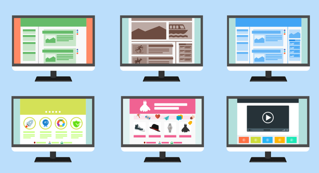
Many companies wanting to increase sales, try different ways to optimize the conversion of the site. In the marketing world, choosing proper colors is seen as a crucial factor. Newbie startups often draw attention to a website with contrasts and bold color schemes – aiming to impress with the most stylish shades. But color can psychologically influence site visitors. Although visual thinking (the psychology of color perception) is not fully understood, there are some color rules you need to know in order not to make mistakes in your design marketing strategy.
How Using The Right Colours Affects Increased Conversions
The factors by which we perform conversion actions on sites or make purchases in stores are innumerable. Maybe we woke up in a good mood, or maybe the weather influenced the decision to buy. But there is something that affects everyone, regardless of other factors. This is the color. The color scheme is important when creating a logo, in developing a corporate identity for a company, and, of course, in web design.
Marketers now have many ways in their arsenal to help attract visitors to targeted action. Influence with color is one of the most “ancient” and simplest ways to influence buyers. Judge for yourself: you don’t need to resort to any additional actions, services, programs, etc. to make your site in a certain color scheme. You just need to know how color affects people and be able to manage this color. With these skills, you will become a powerful master of other people’s subconsciousness!
There is a saying that nothing can erase the first impression. That is why it needs to be the brightest and most memorable. When visiting a site, the first thing visitors pay attention to is the colors.
Kellerman-Plutchik’s theory of emotional behavior
Before figuring out “How Colour Psychology Affects Site Conversions”, you should familiarise yourself with the Kellerman-Plutchik theory of emotional behavior:
All emotions are divided into positive and negative (encourage action / stop a person from action). Plutchik’s model is based on three sensory and emotional tendencies: aggression, submission, and alienation. Mental processes are viewed as the transformation of “central” affects into basic and composite emotions, feelings, and moods. So, in the second circle from the center, there are eight basic bipolar emotions: joy, sadness, fear, trust, expectation, surprise, anger, dislike. Their combinations generate more complex emotional responses. In the arithmetic of emotions, different options are possible:
Joy + Recognition = Love;
Fear + Recognition = Submission;
Trust + Anticipation = Hope;
Joy + Anticipation = Optimism;
Sadness + Anticipation = Pessimism.
Basic color theory
Professional artists and designers are very familiar with the theory of color, where everything is not so simple, because there are many definitions, design decisions, and concepts. For example, the RGB color model is based on red, green, and blue, and the rest of the hues are obtained by mixing these primary colors.
It’s impossible to test all valid color combinations and their effect on conversions, but here are some helpful tips on how color affects user behavior:
Use contrasting colors. The opposite color on the color wheel gives the most contrast – it improves the readability of the text and draws attention to specific elements on the site, such as a call-to-action button.
Complement the primary colors. The complementary color is adjacent to the base color on the color wheel. For example, the complementary color for red is orange and for blue it is cyan. They cause resonance. This refers to the general perception of certain color sets: bright and warm colors (red, orange, yellow) tend to give us energy, while darker and colder shades (green, blue, purple) have a relaxing and calming effect.
Given the endless number of possible color combinations, it can be difficult to decide which ones will have the greatest impact on your site, what emotions will be of visitors, what will grab their attention and put them in a good mood for action (subscription, purchase, and other types of conversions).
Age and gender preferences
There are differences in color perception between men and women. Male audiences will love blue and black, as well as green. In design, men are more likely to appreciate bold colors. Not many people like brown, orange, or purple.
Women love soft shades of their favorite colors: blue, purple, or green. They will be attracted to colors with shimmer or muted tones, such as whitened shades of pink. They do not like orange with brown, as well as grey.
Children love warm and vibrant colors as well as rich colors. Young people are attracted to orange, yellow, and pink (warm colors). Older people prefer cool and “calm” colors, such as blue, and blue-green.
Favorite colors of consumers
Impulsive shoppers are attracted to Royal Blue, black, and red-orange colors. They are used in the field of fast food, with total sales, on the websites of shopping centers. Taunting colors sell great, stimulating rampant consumption.
Budget-conscious consumers will love the refreshing sea blue, turquoise. These colors work great in specialty sales.
The average consumer is encouraged to buy varieties of pink and sky blue, colors commonly used in online clothing retailers.
Red
The color of quick decisions involuntarily accentuates attention. Powerful yet controversial. Increases heart rate, increases blood pressure, and creates a sense of urgency (which is why it sells well). Suitable for food, transportation, tech, and agriculture sites where determination is essential. Red has a detrimental association with militant brutality and intolerance.
Where a destructive message is inappropriate, it is better to avoid red. Moreover, red tires quickly. Its bright accents should be combined with soothing colors to maintain harmony in the design.
Blue
Blue is often used in sales – it has a positive impact and is unmistakably perceived by all people – in brand designs, banking, and business websites; creating a sense of honesty and security. This comfortable color is associated with calmness, productivity, and professionalism and gives a sense of trust. It is used: in medicine, finance, energy, and technology niches. Not recommended for use on food sites, auto-themed sites, and clothing manufacturers.
Green
Easy to perceive and the most joyful colour: evokes a feeling of peace, maturation, naturalness, and harmony. Its calming green color has been used by sales sites, allowing customers to relax and enjoy exploring a quote. Well suited for energy, finance, technology niches; food websites, and housewives blogs. Green will not represent an auto brand, a fashion site, or a medical one with a controversial result.
Orange
Aggressive and highly visible color. Alarm fences are colored orange, and on websites, Call-to-Action buttons. It is the color of confidence, optimism, enlightenment, and creativity. The colour is popular in healthcare and technology niches, but not very effective for such topics: as clothing, finance, aviation, auto, and energy.
Black
Not being the color of the spectrum, it impresses with the most elegant shades. This has been noticed by many brands and companies looking to shine with elegance. It has become a popular marketing strategy to use shades of black when selling luxury goods and expensive products. Sites of fashion, auto brands, and cutting-edge technology excel at this. It is not very effective to use black in the food industry, energy, healthcare, and financial niche.
White and silver
Helps to express ideals of excellence. This is why shades of white or silver often appear in cleanliness advertisements. These colors effectively market clothing, credit cards, and medical care and are not recommended for financial websites or the food industry.
Purple
It is widely used for advertising/marketing cosmetic and aesthetic products, due to its associations with greatness, power, and well-being. Color works well in medical website designs and tech and financial brands. Magenta (violet) is not as appealing to the energy and agricultural niches.
Yellow
An ideal choice for business websites looking to evoke feelings of joy, optimism, and energy. Most often associated with food, but can be used by brands to convey a cheerful message to their customers. Widely used in household, energy, and food brand niches.
How to choose a color for the best conversion
Coming back to conversion, it is important to understand that color allows you to visualize the site and give an initial idea of it. On an airline website or natural drinking water, we expect to see a predominance of blue and light blue, and on an environmental organization’s website, green. Experts from a web design company in Sydney assure you that your color preferences mean very little in this regard. Before you start designing, you should keep in mind what the main purpose of the site is and who your target audience is.
Colour can improve your conversion rate
Successful sites have already incorporated color perception into their branding strategy. The secret of conversions is a successful color scheme that evokes emotions of a positive series, with a sufficient understanding of the psychology of visual thinking of the audience. 93% of shoppers believe color determines their choice, and 52% will not return to a site that does not meet the aesthetic requirements.
Conclusion
Colors and emotions are what you should consider when designing your site. The aesthetic interface is certainly pleasing to the eye, but its colors can convey positive/negative emotions. Even a subtle relationship will psychologically increase the value of the resource for users, or lead away from the goal. Every site is unique, so test and measure conversions until you get the desired result. What’s your favorite color?
You might also like,


